MOBILE APP
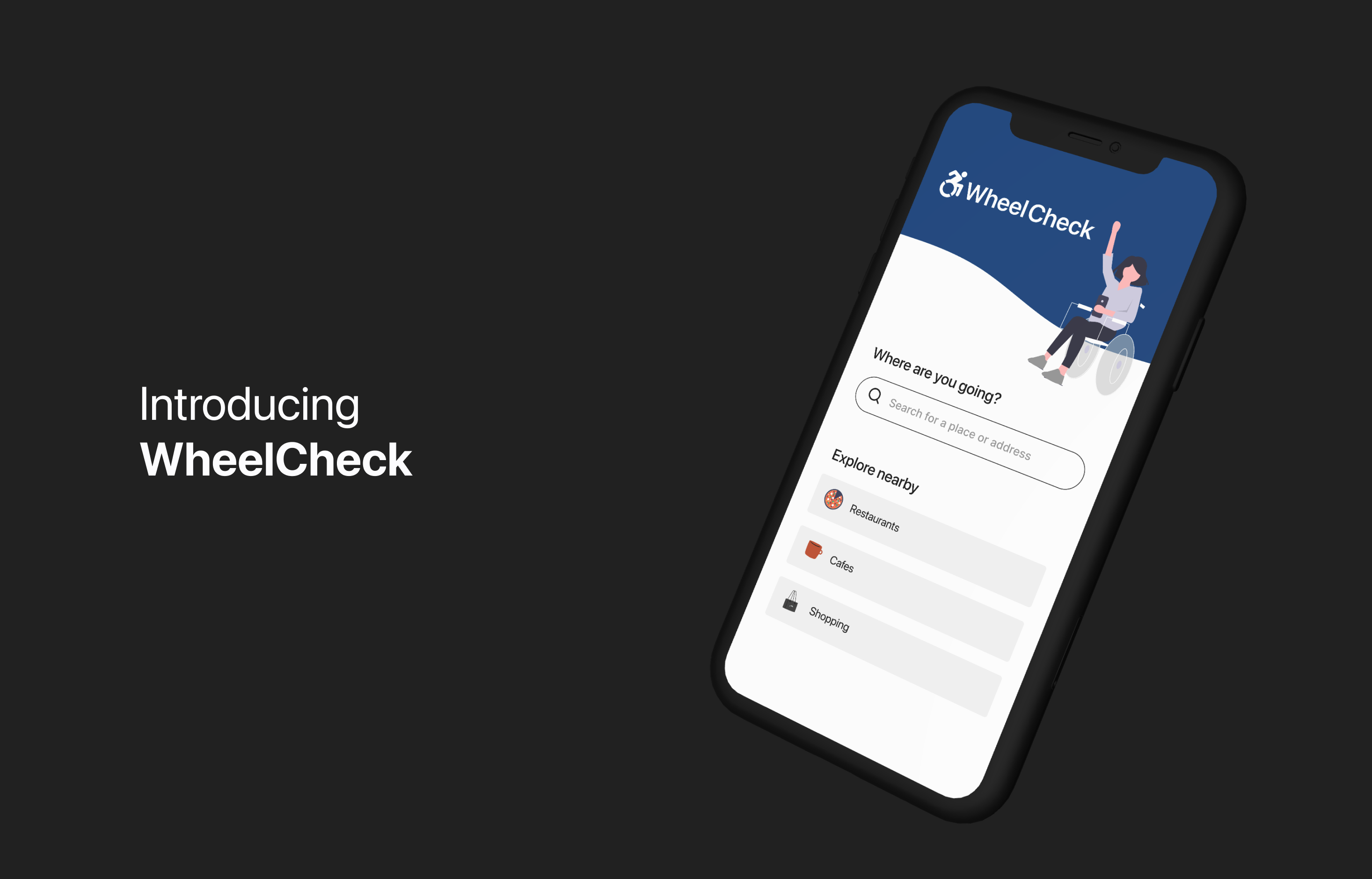
WheelCheck
Designed a mobile app aimed to improve the travel experience for mobility device users. WheelCheck provides accurate and detailed accessibilty information for locations, empowering users to navigate and explore places.
Role: UX Designer
Timeline: 5 weeks
Tools: Figma, InVision

PROBLEM STATEMENT
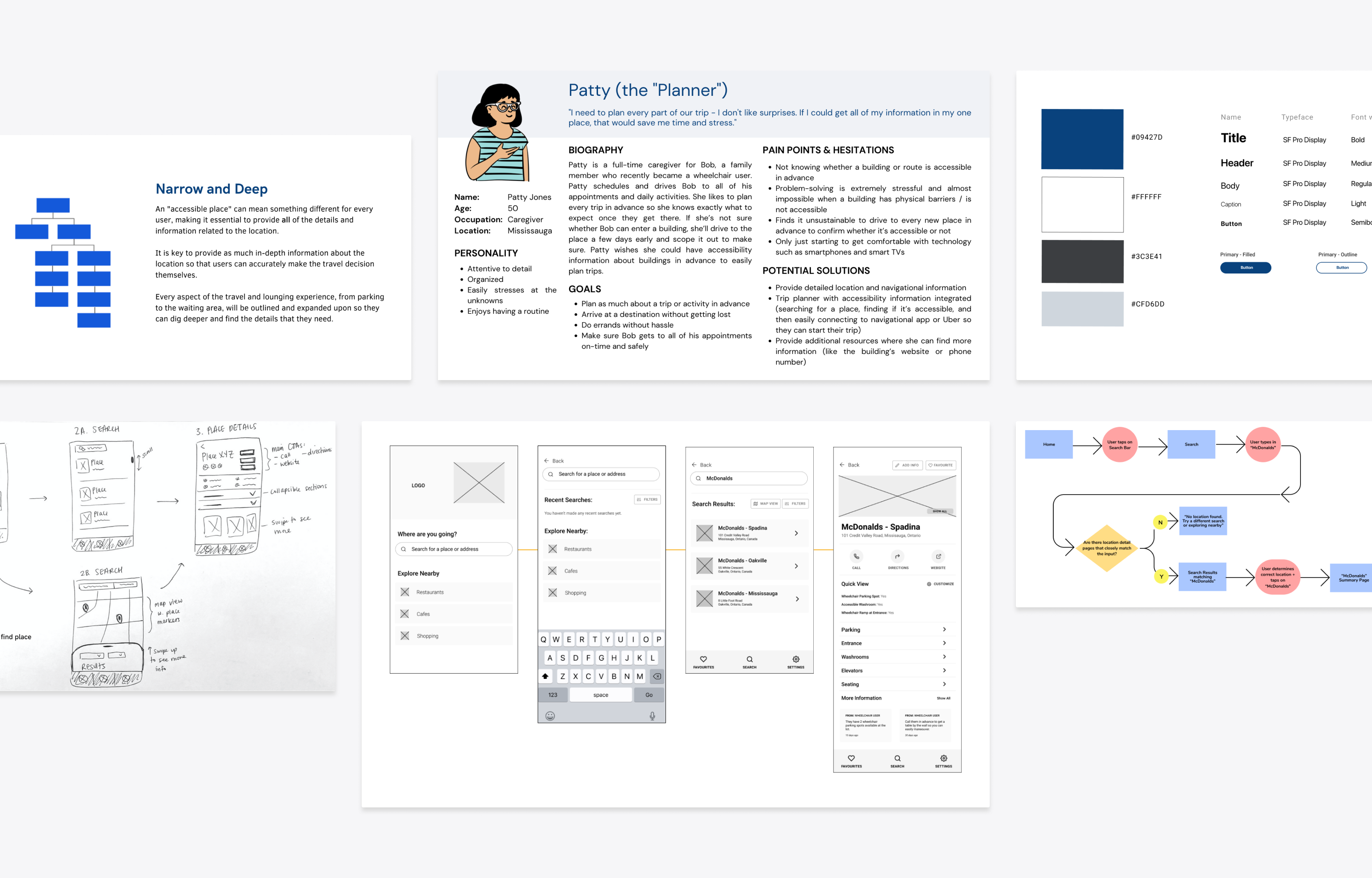
It's challenging for mobility device users to explore new places and travel.
There are a lot of physical barriers that can prevent users who use mobility devices (such as wheelchairs and walkers) from traveling to and comfortably staying in places. Information about whether a location is accessible for them is also not easily or readily available, making it even harder for users to be prepared for their trip.
USER DISCOVERY AND RESEARCH
What is the travel experience like for users who use mobility devices?
To gain a better understanding of the target users, those who use mobility devices and their caregivers, I conducted user interviews to dive deeper into their daily travel experience - what are their needs, motivations, and frustrations?
Key questions:
- How do users define accessibility and their accessibility needs?
- How do users plan their trips and routines?
- What type of information do users need to know to travel and how do they obtain this information?
 Building Barriers
Majority of buildings have physical barriers, making most places inaccessible or inconvenient for mobility device users.
"There were stairs at the entrance and no ramp for the wheelchair so we couldn't find a way into the building."
Accessibility Needs
An "accessible place" can mean something different for every user - everyone has their own requirements or decision criteria.
"The bathroom entrance might be big enough for a small wheelchair to get through, like the ones that can fold, but not the manual wheelchairs that we use."
 Trip Planning & Decision Making
Having accessibility information about a location in advance is essential, as it helps users effectively plan for their trip (or help them decide not to go).
"If we know that parking is going to be difficult for the wheelchair, we schedule a wheelchair taxi that can just drop us off on the street in advance."
Information Sourcing
Accessibility information is not readily available for most places and sourcing this information can be time-consuming.
"I often drive by the location a few days earlier to confirm whether we can easily enter the building or look at 'streeview' on Google Maps."
Hesitations and Anxiety
Visiting a new place is anxiety-inducing and stressful for mobility device users.
"We never dine out because it's just too complicated to find a place that can accomodate table arrangements for a wheelchair."
Desire to travel
Traveling provides personal and social fulfilment for users but they often have to resort to places they've already been to.
"I miss out on a lot of things by staying home."
SYNTHESIZING FINDINGS
Leveraging user insights to shape the value proposition and experience
- Detailed accessibility information would empower mobility device users to explore new places by giving them the information they need to decide whether a place is suitable for them and avoid having to go back home as a result.
- Readily available information would improve the travel experience for mobility device users by giving them the opportunity to prepare for their trip in advance and conveniently arrive.
- Information provided by fellow users would help the trip-planning process by validating accessibility features that are key to their decision-making.
USABILITY TESTING
Refining the solution based on initial user feedback
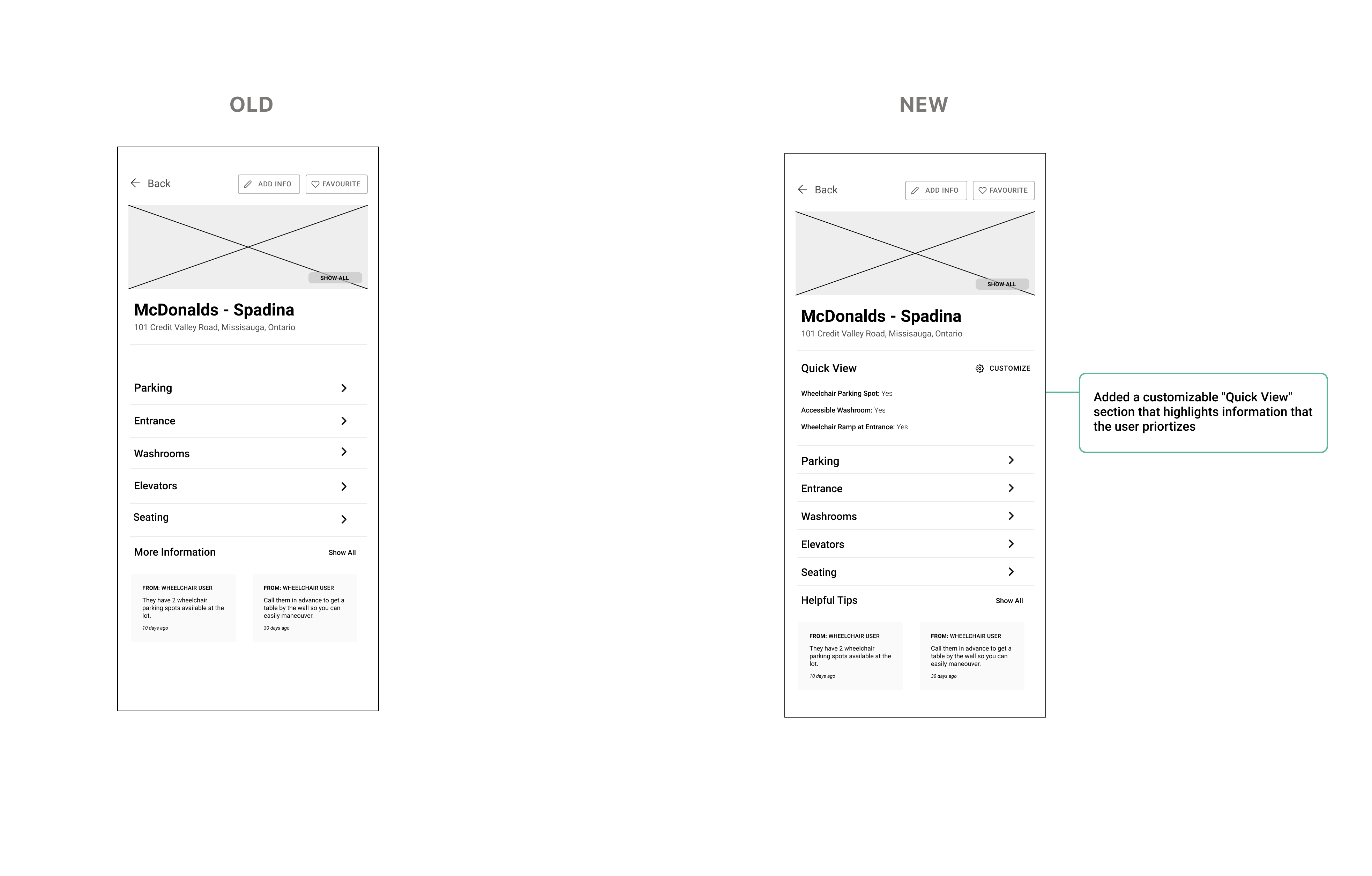
01. The level of information that needs to be available on the screen is different for each user.
The initial summary screen for a place didn't reveal any accessibility details but hinted that they would be if users collapsed the appropriate sections. Some users found it to be too much effort to tap on every section to find their answers, especially if they were tapping the same sections every single time.
Solution: Based on their feedback, I created a customizable "Quick View" section that highlights information that the user priortizes, making their decision-making process more efficient but also ensuring that the decision was ultimately defined by the user.
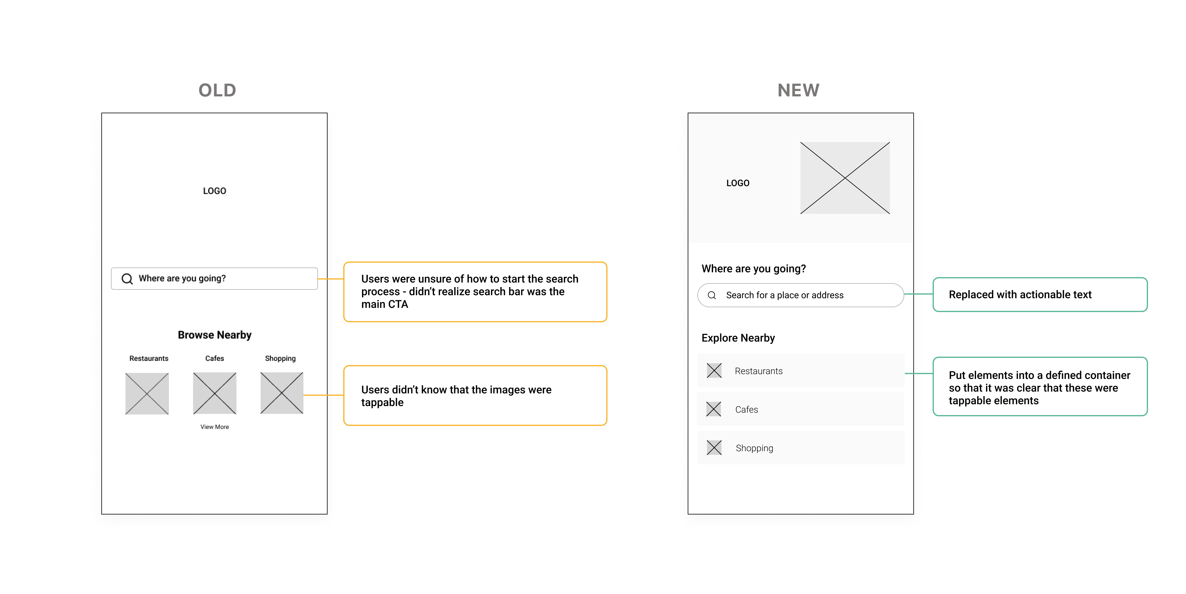
02. Additional context and direction was needed to help facilitate the mobile experience.
Majority of our target users were not active users of mobile apps and were unfamiliar with the ways you can interact with a screen. For example, users did not know that buttons without borders were tappable CTAs. Users were often stuck on a screen and not going through the flow as intended.
Solution: I redesigned main CTAs and added explanatory text (like adding words beside icons) when possible.
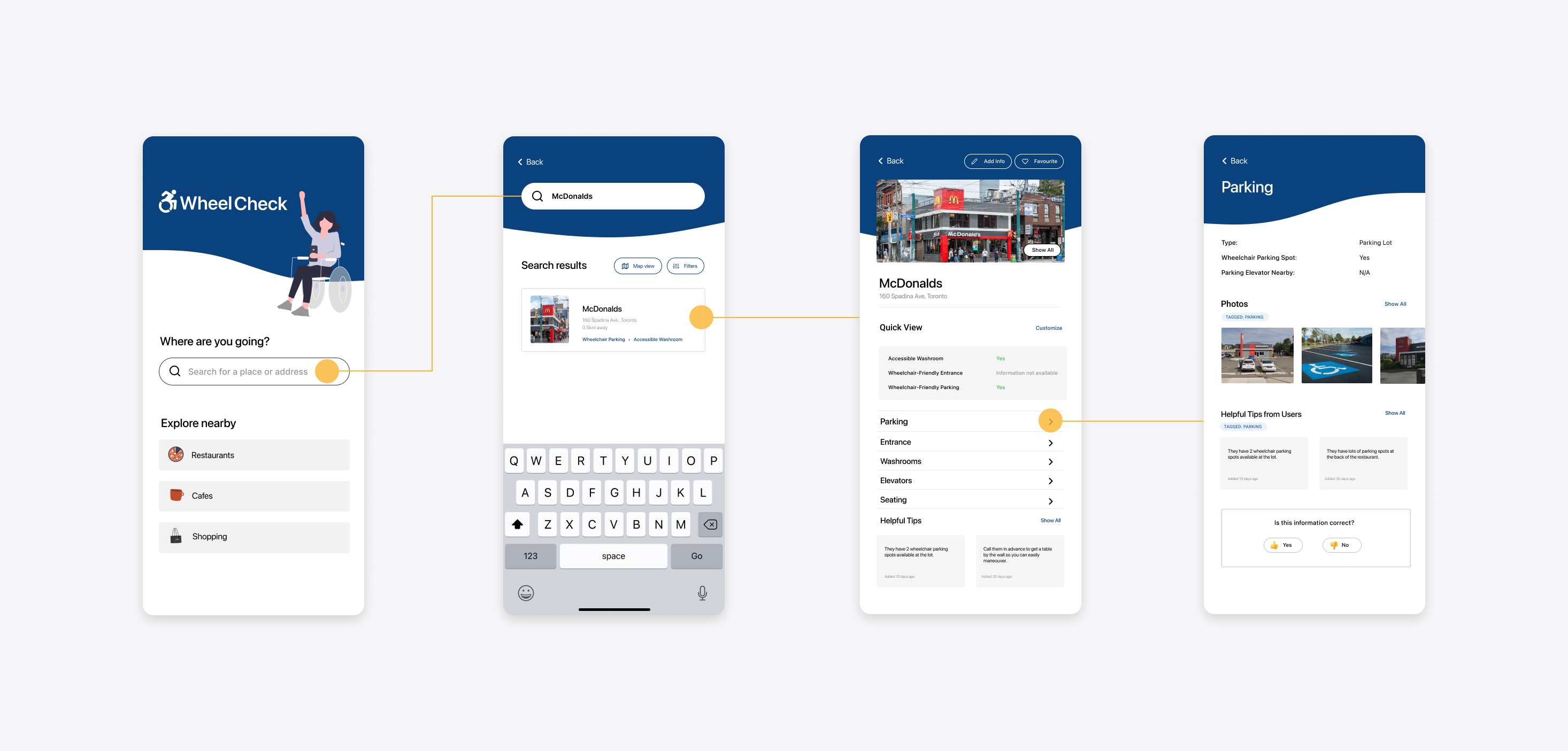
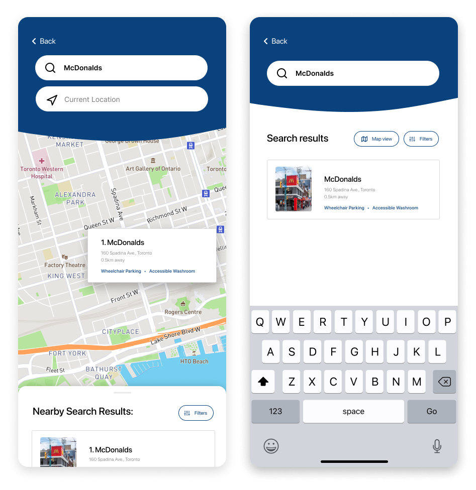
Information that is readily available
Accessibility information that is organized and categorized on a mobile app so that users can quickly make decisions at the comfort of their own home or while they're on the go.
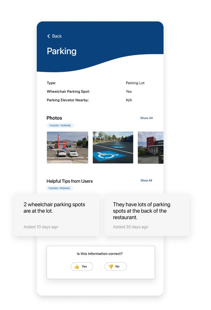
Detailed accessibility information
Providing a database that is relevant for mobility device users, like whether there is a ramp at the main entrance or if the washrooms are big enough to fit a wheelchair.
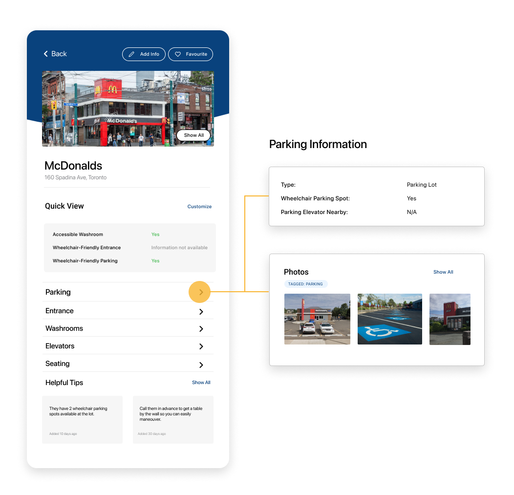
Information added and verified by fellow users
Fellow mobility device users and caregivers know first-hand the travel experience and can validate the information that is crucial to decision-making. Users can add more details like pictures and tips, and report inaccuracies.
Key Learnings
Design for your users and not for yourself.
I designed the initial wireframes with my preferred minimalistic style and utilized what I thought were "best practices" for apps, only to discover that it was not resonating with my target users. For example, the initial use of ghost buttons (or buttons without borders) did not call out to the target user and hindered the intended flow.
Through this project, I learned the importance of leveraging user insights to drive design decisions forward rather than your own personal assumptions or design preferences.
Naomi Chun -
Creating data-driven and thoughtful experiences for the user and business